
Overview
GemBet is an iGaming platform expanding into Southeast Asia. In this independant research, I focus on redesigning the landing page (above the fold) and registration flow to ensure the experience is locally relevant, trustworthy, and intuitive.
CLIENT
GemBet
YEAR
2026
ROLE
UX/UI Designer
UX Researcher
KEY outcome
A clearer path from first visit to deposit
Greater confidence at key commitment points
Challnege
Help GemBet enter the Southeast Asia market with a UX strategy that improves trust, clarity, and conversion.
Goal
Translate the strategy into targeted design improvements across the landing experience and registration flow.
Secondary Research
Understanding what users need before committing
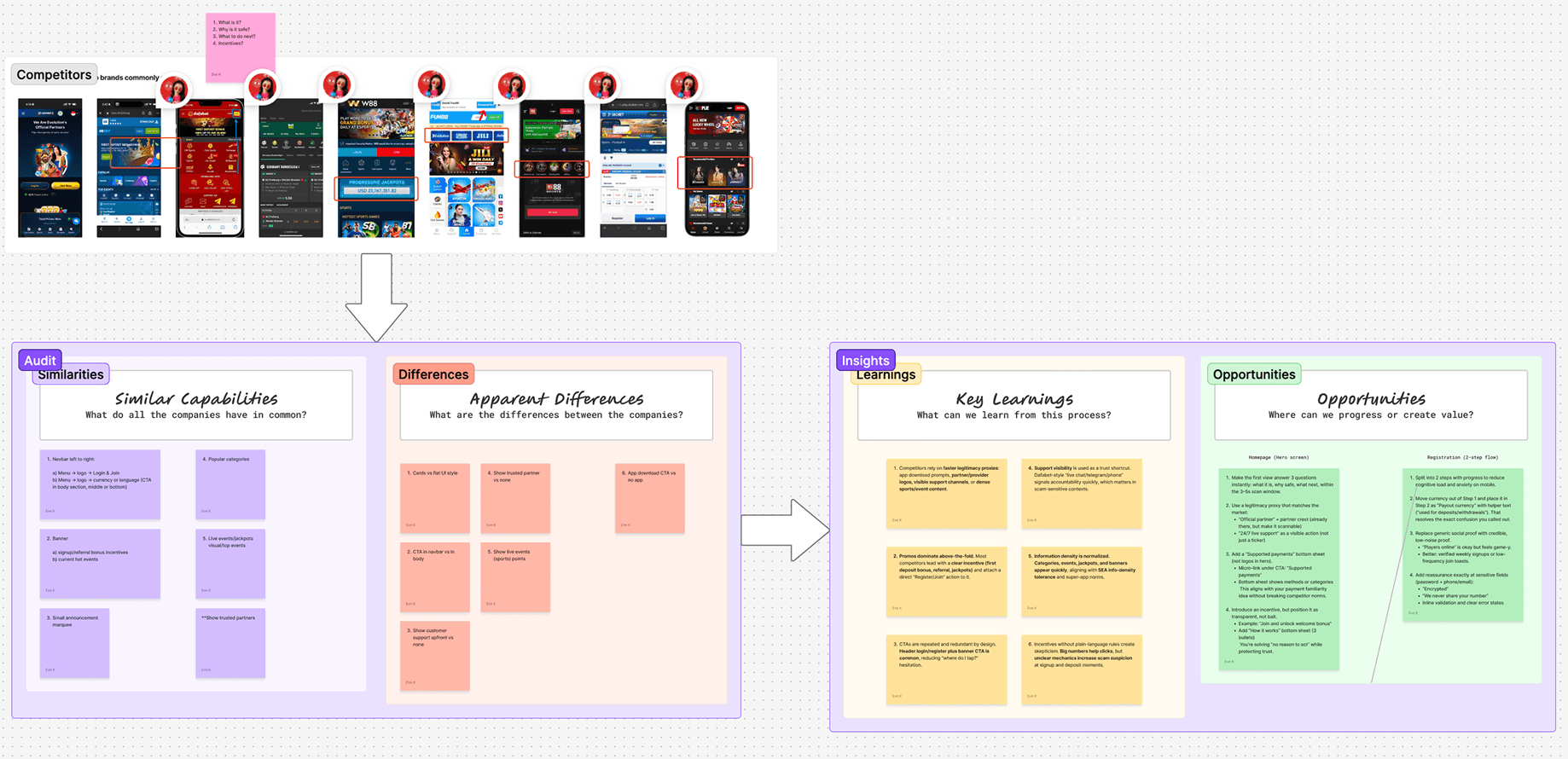
I combined SEA behavioral research, competitor analysis, and a UX audit of GemBet’s landing and registration journey. Two patterns shaped the direction:
Trust is judged within seconds
Users quickly scan the offer, credibility signals, and next action before continuing.
Commitment requires reassurance
Clear rules, payment transparency, and visible legitimacy matter before registration or deposit.
UX Audit
Where the experience fell short
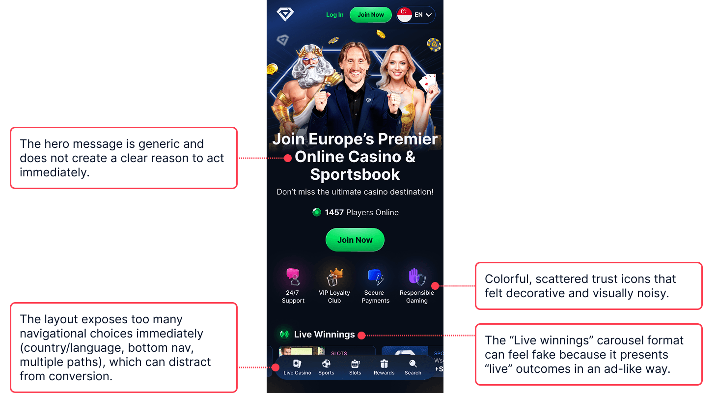
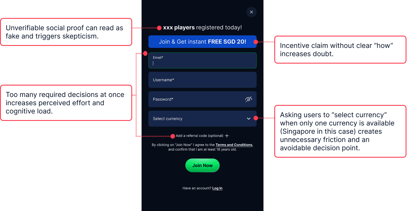
GemBet’s generic messaging, scattered trust cues, and competing actions made the first step unclear. Registration then introduced too many decisions without enough context.
Landing page
Sign-up
Design direction
Establish credibility immediately
Make one primary action clear
Introduce decisions progressively
Reinforce trust before deposit
ChatGPT, Claude, and FigJam AI supported research synthesis and finding organization.
Starting The Design
Prioritizing usability before visual execution
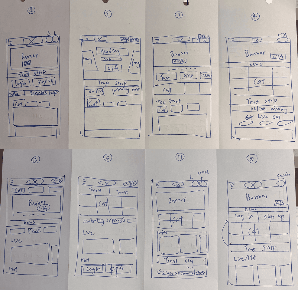
8s to explore how different layouts could improve information hierarchy, scanability, and trust visibility. I evaluated each direction against the priorities identified during research, then shortlisted the strongest patterns.
I used Claude and v0 to expand the shortlisted ideas and compare more variations. This kept production time focused on the most usable direction and avoided unnecessary design cost.
Home page - Defining the role of the first screen
The first screen needed to communicate GemBet’s offer, establish legitimacy, and provide one clear next action.
I built the hierarchy around a single offer and CTA, consolidated trust signals, and presented provider logos as supporting proof. I also delayed the bottom navigation until users began scrolling, reducing competition for attention on entry.
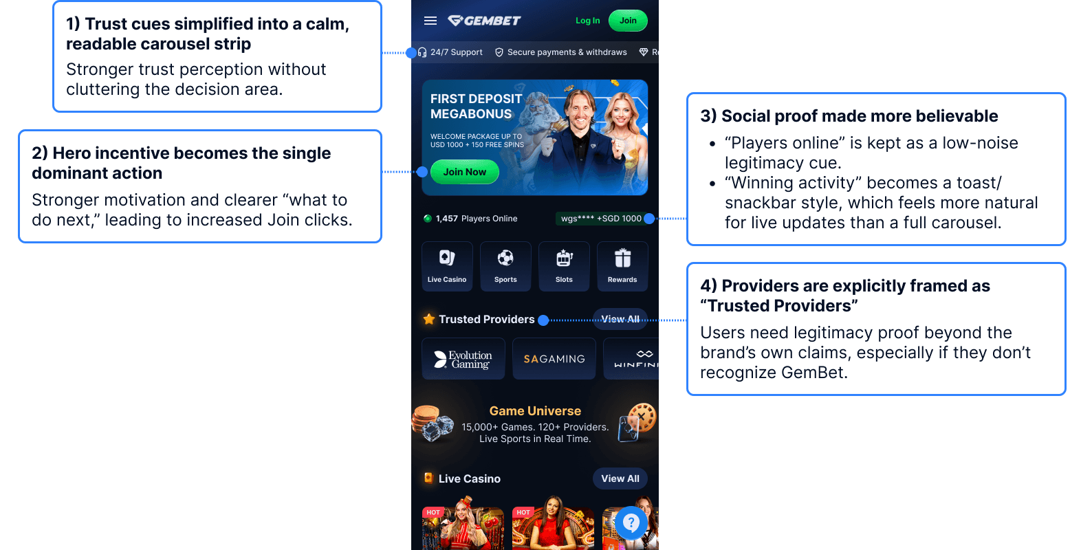
Redesigned home page
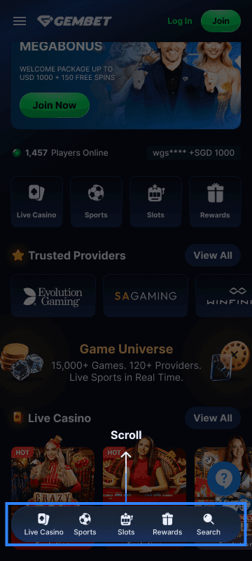
Navigation behavior
Registration Flow - Restructuring the flow around decision priority
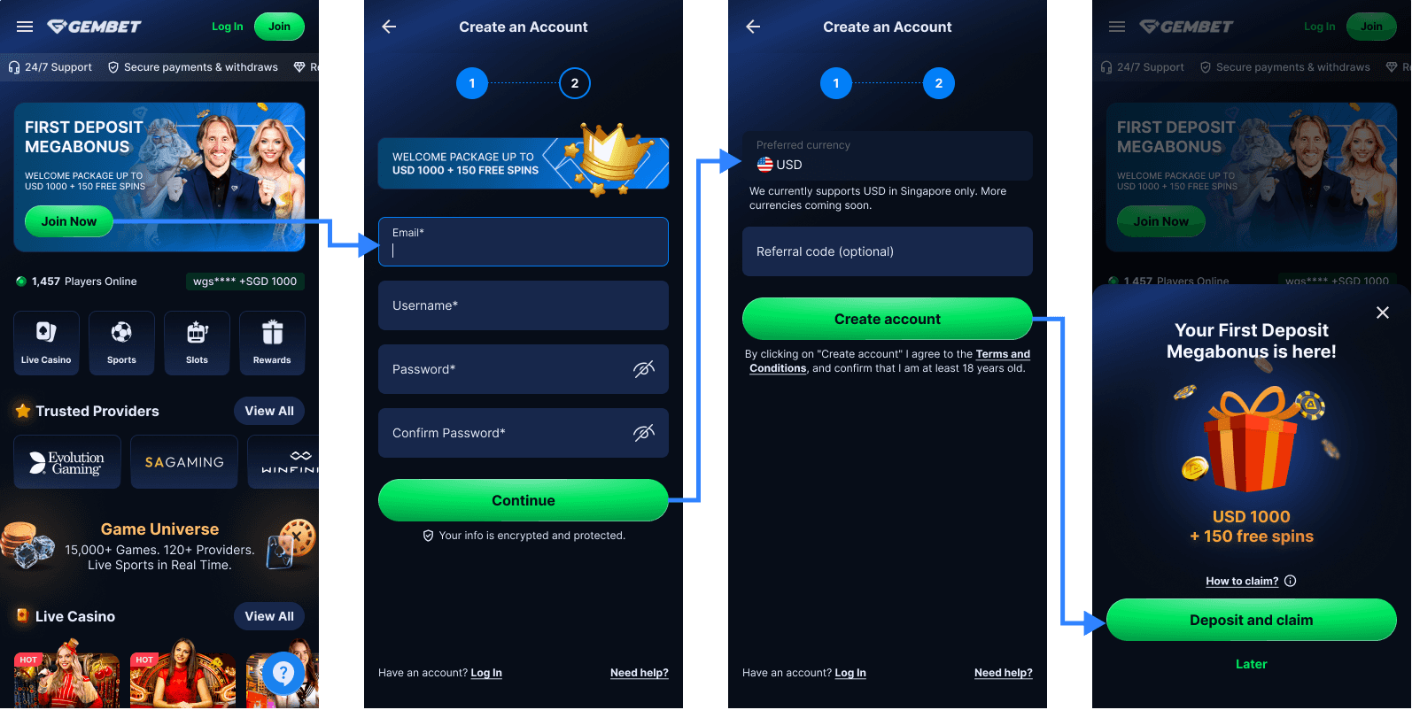
Essential account information comes first, while currency and referral details appear later with clearer context. Progress indicators, password confirmation, security messaging, and visible support provide reassurance throughout the flow.
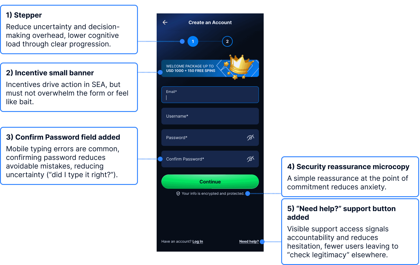
Step 1: Essential account details
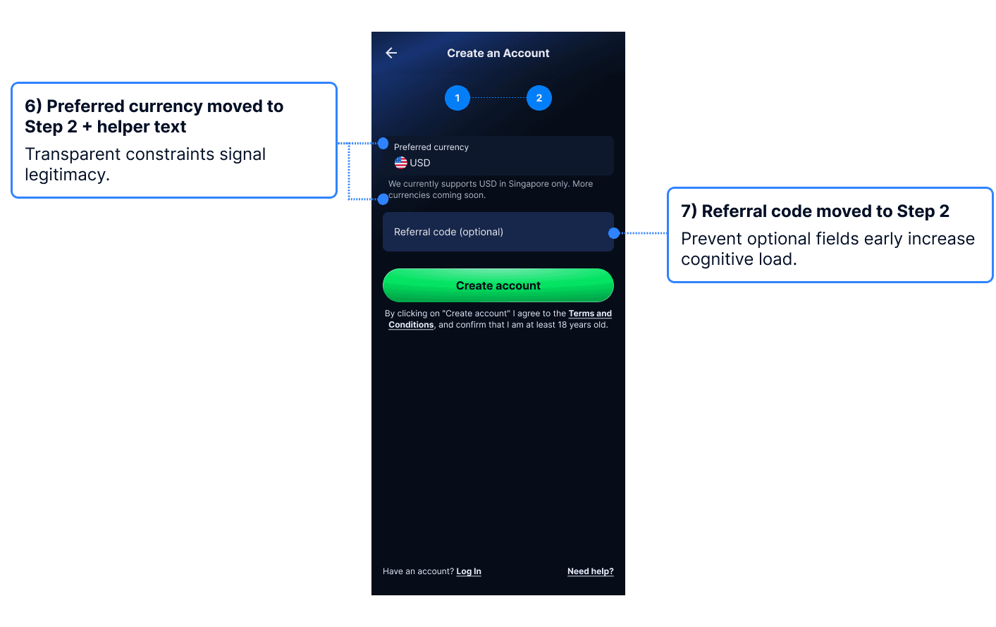
Step 2: Currency and optional information
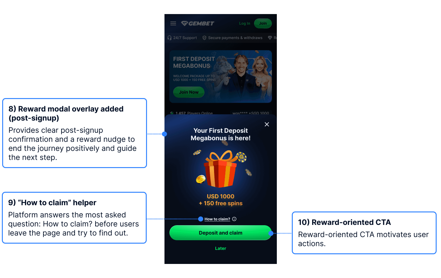
Post-signup reward and deposit prompt
Outcome
A connected path from entry to deposit.
The final concept connects the home page, registration, and post-signup experience as one journey. It improves first-screen comprehension, reduces upfront decision load, and adds reassurance as users move closer to deposit.
Next Steps:
Run a five-second test for comprehension, trust, and CTA recall
Measure drop-off across each registration and deposit step
Compare incentive messaging and CTA emphasis
Other projects


